Mapping IPCC dynamics
Who wrote the first five IPCC reports ? How the contributions for the various countries evolved through time ?
Post
The Intergovernmental Panel on Climate Change is one the most visible, influential and complex institutions of modern science. Established by the United Nations Environment Programme (UNEP) and the World Meteorological Organization (WMO) in 1988, the IPCC “reviews and assesses the most recent scientific, technical and socio-economic information” to provide “a clear scientific view on the current state of knowledge in climate change and its potential environmental and socio-economic impacts”.
Given the stakes of the climate debate and the centrality of the IPCC in such debates, it’s crucial that its findings represent the broadest possible range of climate expertise. This need for representativeness is reflected, to a certain extent, in the composition and structure of the institution. Overseen by a very light hierarchy of rotating chairpersons and vice-chairs, the IPCC functions primarily thanks to the coordinated efforts of hundreds of experts working around the world. Despite this dispersed and networked structure, the IPCC retains a fairly “singular” voice thanks to its rules of consensus. This has created the impression that the institution is more monolithic than it actually is. Within the IPCC there is a rich world of movement—of turnover, longevity, shifting responsibilities and disciplinary bridging—by different contributors across 25 years of Assessment Reports.
Much regard has been given to different rules that shape how the IPCC reports its findings, particularly the effects the rule of consensus has on this reporting (Brysse et al.,2013). But less analysis has been done on the political and communication effects of the IPCC’s own structuring. So it came to us that we could actually map some aspects of this “inner-life” by following the individual participants of the IPCC over time. With this aim in mind, the médialab has constructed a novel database of all 3,443 individual IPCC authors over the last 5 Assessment Reports (ARs) including information on authors’ institutional affiliations, countries of origin, authorial roles and individual chapter participations. This database gives us the means to visualize the life and evolution of the institution.
What follows are a set of preliminary visualizations from our database. These are some basic, early cuts at the type of information that we are in the process of analyzing and interpreting for scientific publication. Eventually, we will make this data available through an online interactive platform that will allow the public and other researchers to conduct their own queries on the IPCC and produce their own visualizations.
See the notes below for more information about geographic grouping and other details.
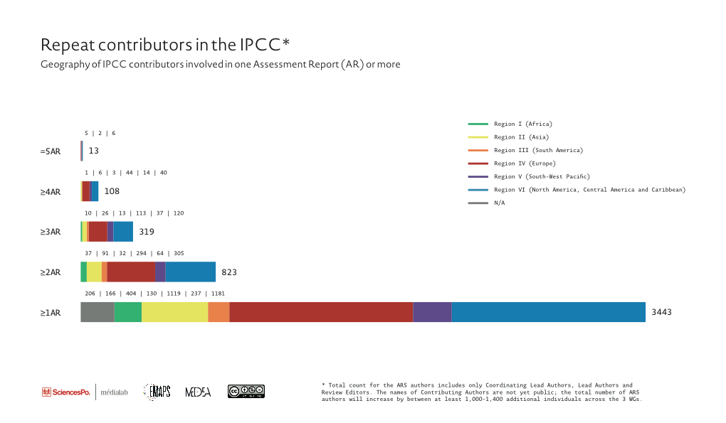
Fig.1 – data available to download in csv format
These two pairs of figures give a window into the longevity of authors and editors within the IPCC and their geographic origins. The top pair represents the subpopulation of contributors that repeat across all 5 Assessment Reports and participate in anything from one assessment report (the total population: 3443 experts and scientists), to 5 assessment reports (there are only 13 people who have been present across all 5). One initial observation is that the proportions between the different regions remain relatively constant, with slightly more continuity of authors from North America, Europe and Australia and New Zealand. The second pair of images covers the same information, but looks solely at the Working Group I contributors. Here we clearly see that nearly half of the repeat authors in the entire IPCC are found in the Working Group 1 and also that there is much less diversity of contributors compared to all three WGs.
Figs.2 a and 2b – data available to download in csv format
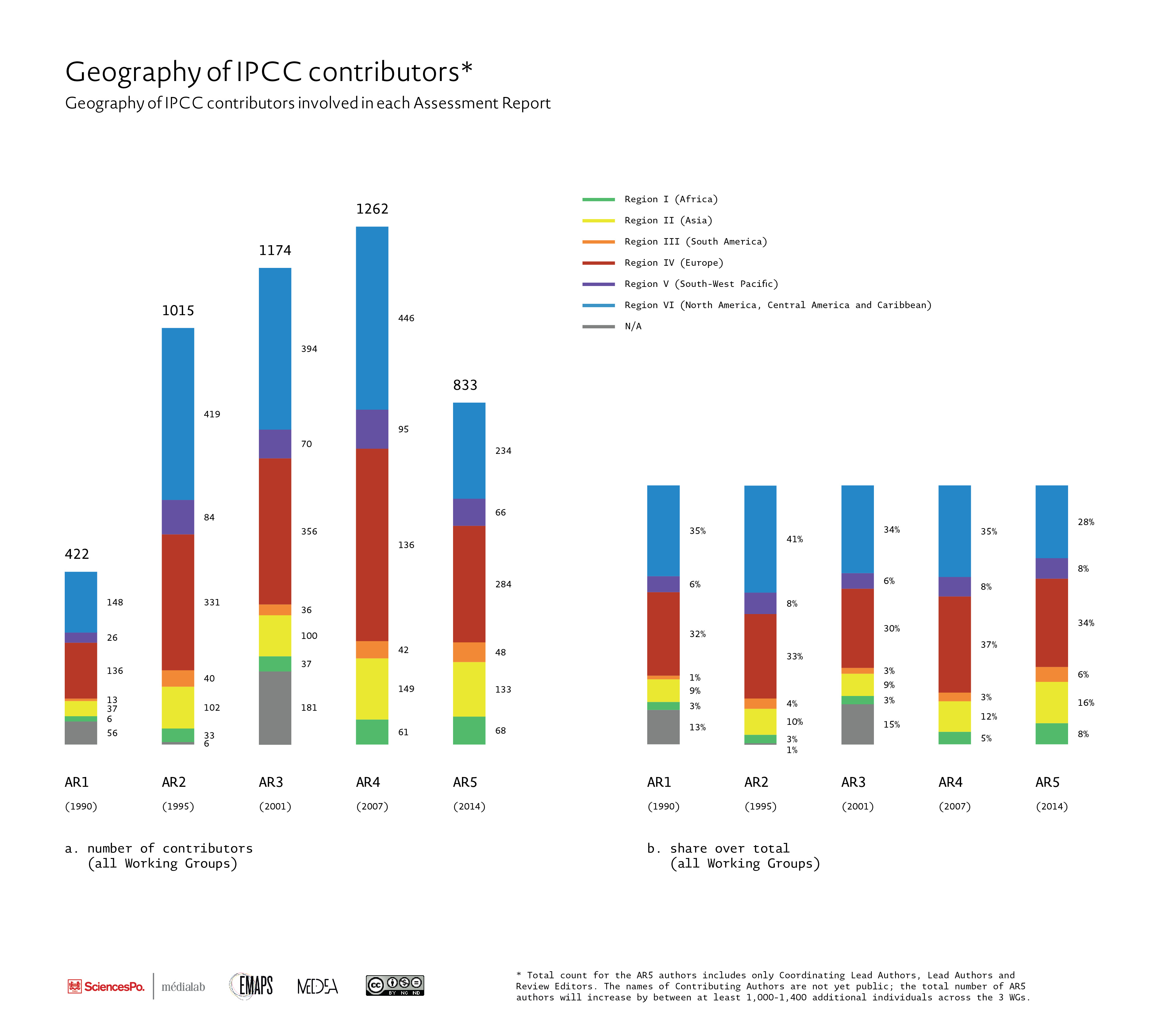
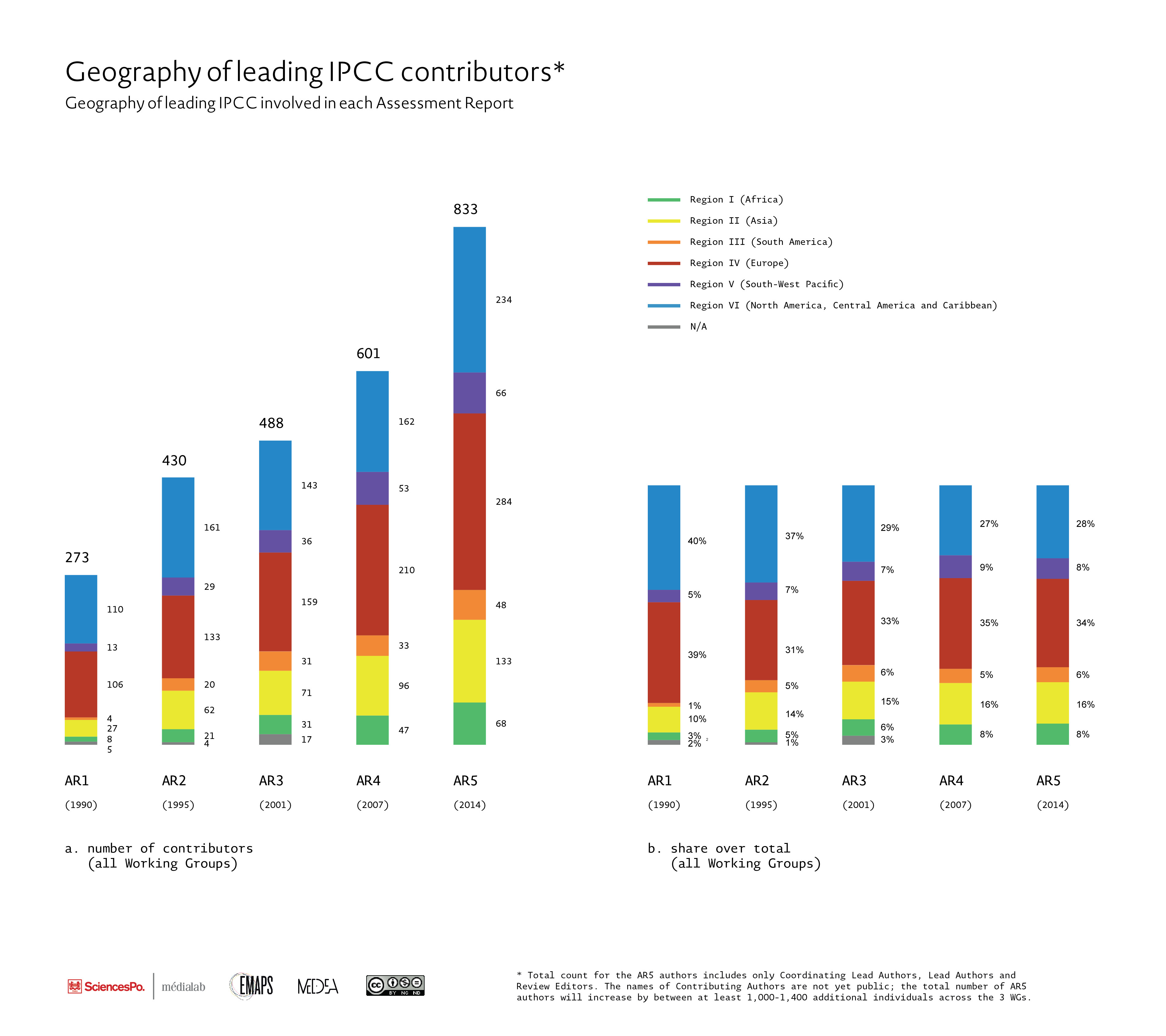
This next two pairs of figures represents the participation of contributors per Assessment Report, from 1990 to 2014. The first set of figures (a and b) contain all IPCC contributors (except those still unavailable for the AR5), whereas the second pair of figures (c and d) contain only those contributors that held roles of responsibility in the writing of the IPCC – i.e. Coordinating Lead Authors, Lead Authors or Review Editors (excluding Contributing authors). We clearly see that there is a significant increase in this subpopulation of “leading” contributors – the number of leading positions increases from 278 (AR1) to 833 (AR5), but that more or less after AR3, the diversity of this group more or less stabilizes.
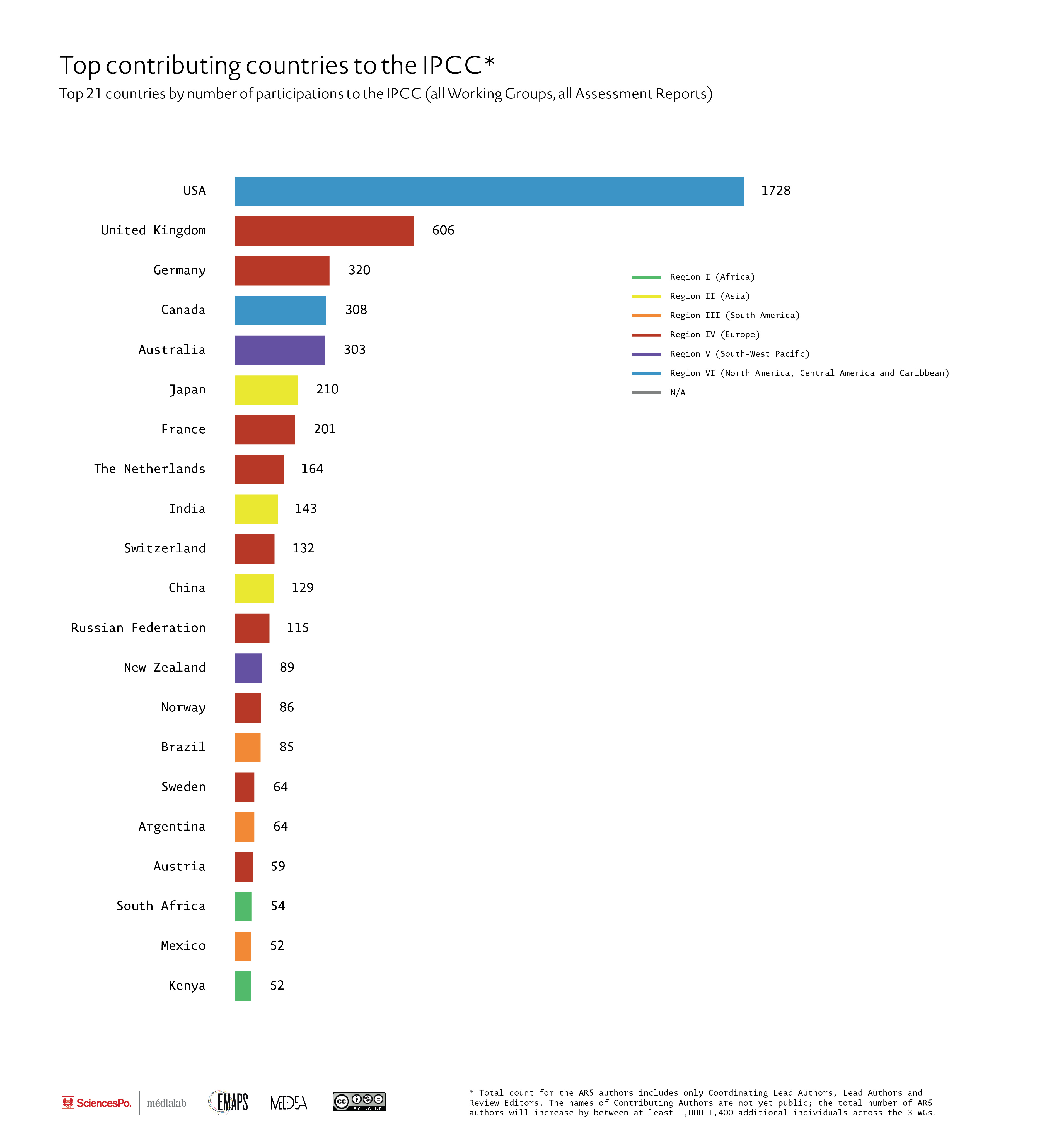
Fig.3 – data available to download in csv format
There are 129 countries that have contributed to the IPCC over the past 25 years. Of those countries that participate, a small portion has dominated the writing and editing of the IPCC reports. Roughly 21 countries account for 80% of all instances of participation (i.e. contributions to a chapter as either CLA, LA, CA or RE) in the reports. And 5 countries (the USA, UK, Germany, Canada and Australia) account for over 50% of all instances of participation, although many emerging economies, such as China, India and Brazil are playing an increasing role within the IPCC.
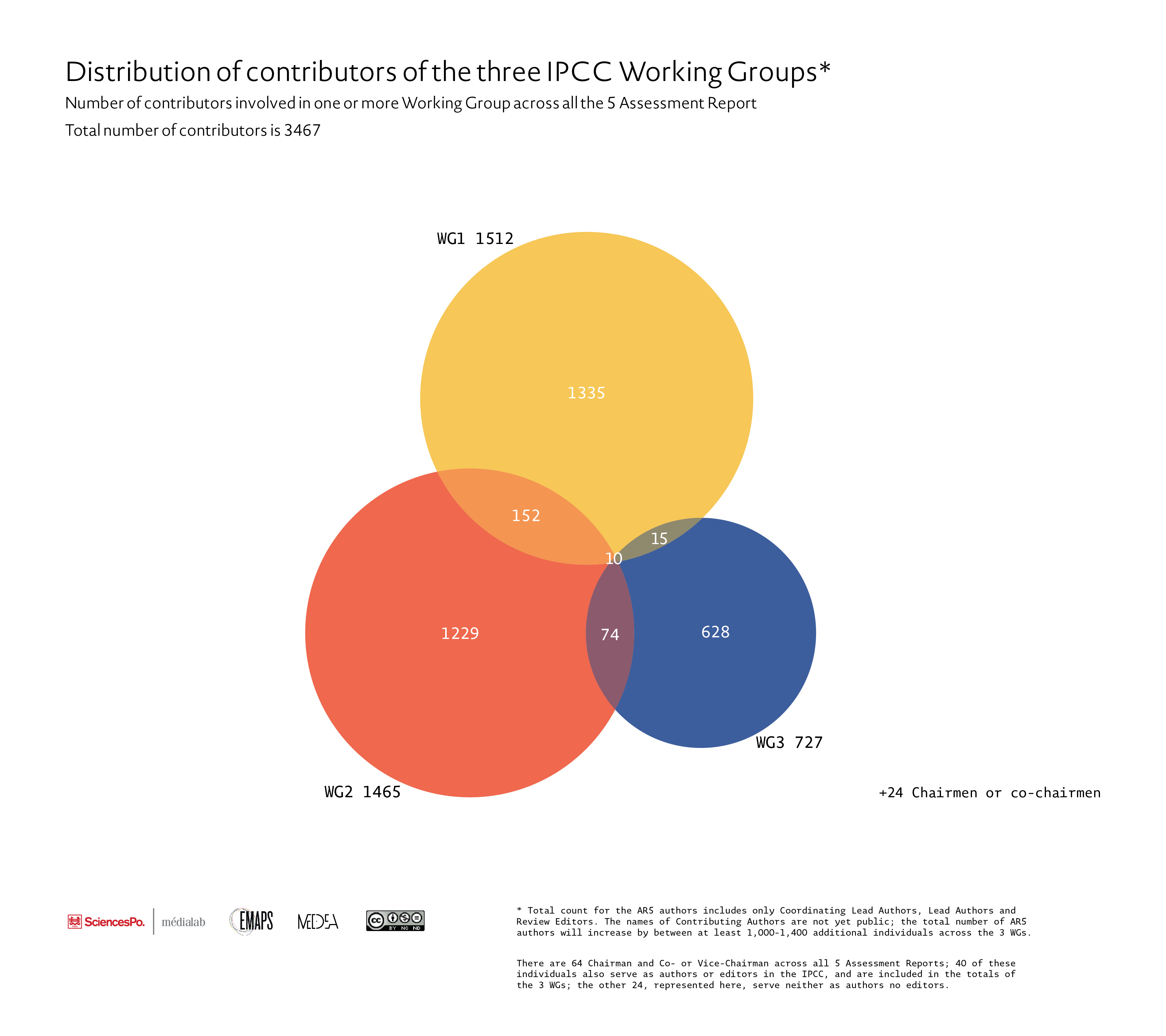
Another way to look at the IPCC, rather than cutting it into 5 Assessment Reports, is to represent it as 3 Working Groups, each with its own population. This visualization indicates that Working Group populations are relatively distinct and have low permeability. Only 7% of contributors across 25 years of the IPCC participate in more than one WG. The large majority of this subpopulation (5%) participate between WGI and WG2, while very few participate between WGI and WG3 (>1%). This is not entirely surprising, given that each Working Group deals with separate issues of the climate crisis (WG1 – the physical science; WG2 – impacts and adaptation; WG3 – GHG mitigation), but it does raise certain questions about the impacts of this separation. During the 2009, for instance, the WGII report was attacked by journalists and skeptics for misinformation about the melt rates of Himalayan Glaciers, the effects of climate on Amazon Rainforest fires and sea level rise in the Netherlands. This launched a massive review process of the entire IPCC rules and guidelines for reviewing literature and communicating its findings, notably by the InterAcademy Council (IAC) 2011 Review of the IPCC (in which the IPCC was entirely vindicated of any wrongdoing, as claimed by its detractors). The IAC Review found, however, that each WG used different communication guidelines, particularly with regards to uncertainty, and called for a standardization of these guidelines. But we can ask also whether this “silo-effect” between WGs influences how the IPCC is able to coordinate the messages delivered by the different groups?
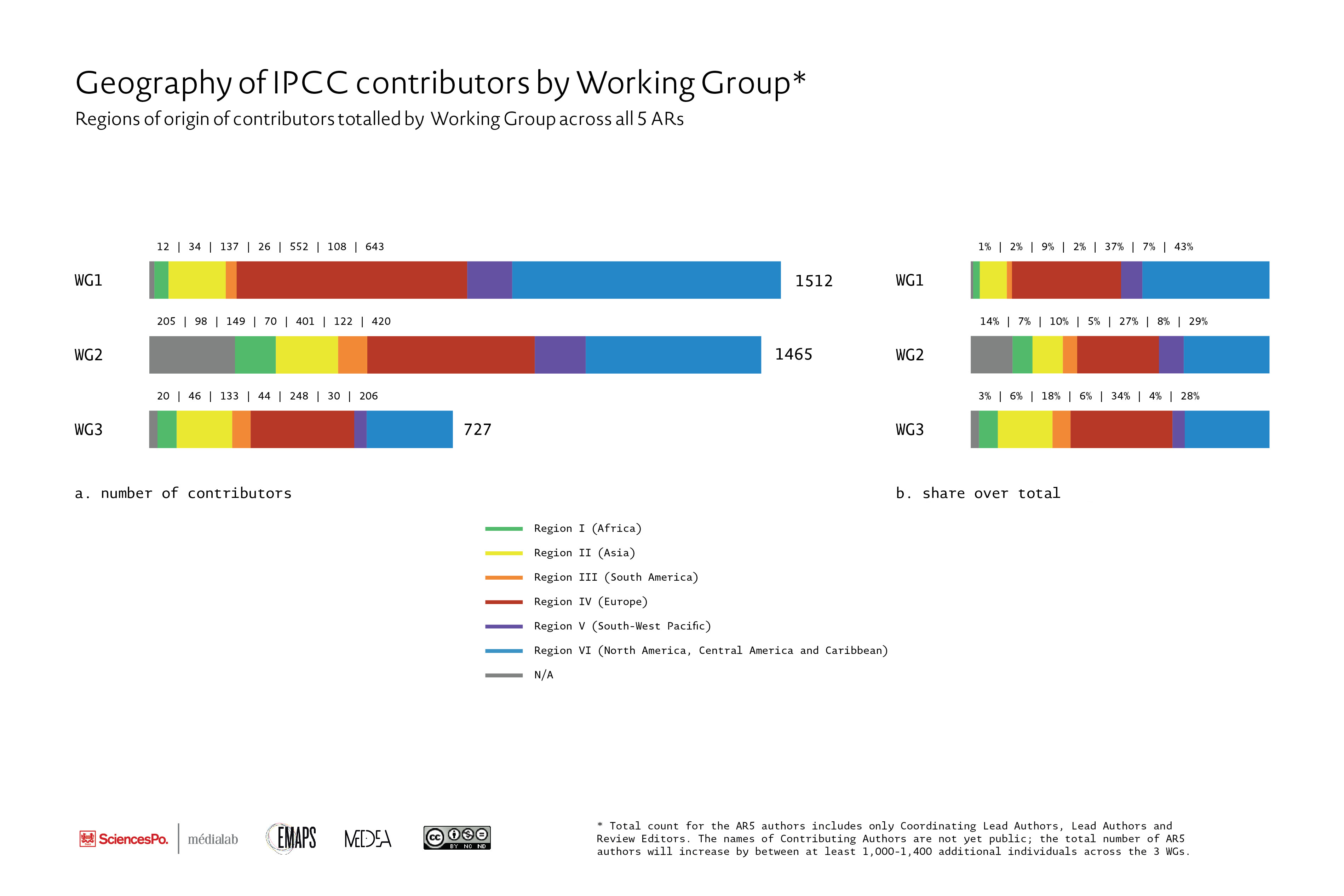
Fig.5 – data available to download in csv format
We see clearly that between the 3 WGs (across all ARs), there is a much more diverse population of contributors between the WG2 and WG3. When normalized, we see that actually WG3 has the most diverse number of contributors. This makes relative sense. WG1 covers the physical science of climate change, so it requires a lot more resources to participate in this WG (such as climate models, seafloor coring ships, buoy and satellite detection systems, etc.). WG2 and WG3 are much more reliant on regional knowledge, which gives an advantage to more localized experts.
Notes
1) On all visualizations, we do not yet have author information for the Contributing Authors of AR5. We will incorporate these missing authors as each Working Group’s Assessment Report is made available to the public on the website of the IPCC. For instance, the IPCC Secretariat has already noted that there are 600 Contributing Authors for the WG1; We can estimate that we will add between 1000-1500 contributing authors to the overall database by the end of 2014. So please stay tuned!
2) In all our figures, we define a “contributor” as an individual who filled one or multiple of the following roles: Coordinating Lead Author, Lead Author, Review Editor or Contributing Author in one of the IPCC ARs. We define “participation” as an instance in which a contributor intervened in a specific chapter in a specific WG of any AR. The same contributor may have more than one participation in any given AR.
3) The geographic regions used in our visualizations represent the six geographic regions designated by the World Meteorological Organization (WMO), which are the official regions used by the IPCC to indicate geographical origins of their contributors. These include Africa (Region I), Asia (Region II), South America (Region III), North America, Central America and Caribbean (Region IV), South-West Pacific (Region V) and Europe (Region VI)
4) The images are released under the Creative Commons License “Attribution-Noncommercial-NoDerivs 3.0 Unported” but feel free to write us is you’d like to make modifications to any of the visualizations below.
5) Our database was constructed over 11 months by (Nicolas Baya-Lafitte, Audrey Banyex, Ian Gray, Guillaume Plique and Tommaso Venturini). We scraped all the names of the contributors of each Assessment Report from the publicly available reports (nearly all in PDF format) and initially entered them into spreadsheets. We copied contributor names directly from AR pdfs, pasted this information into text editors, separated the different lines of data for export into Excel and then began the long and arduous task of correctly structuring our data as well as harmonizing information across different data sources. To our additional benefit, nearly all the authors, starting with the First Assessment Report (FAR, 1990), were also associated in the documents with their institutional affiliation, the country of origin of their institutional affiliation, the Working Group WG(s) in which the author participated, the chapter(s) in which they participated and their role in each of these instance (CLA, LA, CA or RE). For the structure of our data-sheets, we initially constructed two entirely separate excel files to house information related to individual authors and their various institutional and country affiliations, and a second file system to capture their participation in specific chapters of ARs. Eventually, this system became too cumbersome to manage, so we migrated all of our data into a dynamic database designed in MySQL. We will eventually be making this database publicly available, as well as integrating the data into a user interface.